
If you operate, specify, or troubleshoot a centrifugal compressor, you’ve almost certainly seen its performance curve. At first glance, it can look like a confusing collection of lines on a graph. But this single chart holds the key to understanding how your machine will behave under every possible operating condition.
A compressor map explanation isn’t just academic. Knowing how to read it lets you avoid catastrophic surge events, identify efficiency sweet spots, and predict what happens when process conditions change. This guide breaks down every essential element of the performance map into clear, actionable terms.
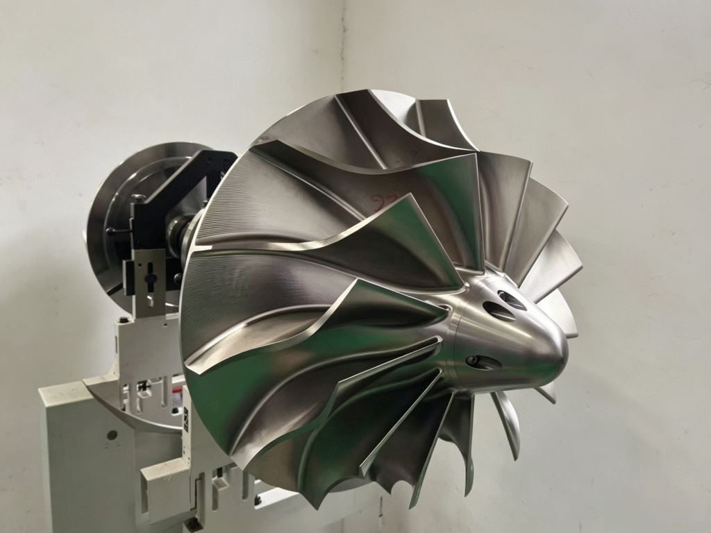
What Is a Compressor Map?
A performance curve, often called a compressor map, is a graphical representation of the relationship between four critical variables:
Flow (Inlet Volume Flow) – The x-axis, often in actual cubic feet per minute (ACFM) or cubic meters per hour (m³/h).
Head or Pressure Ratio – The y-axis, representing the energy imparted to the gas. It can be shown as polytropic head (meters or feet), discharge pressure, or pressure ratio.
Speed – Shown as a family of curves, each representing a constant rotational speed (RPM).
Efficiency – Overlaid as efficiency islands, showing how effectively the machine converts mechanical energy into gas compression.
The compressor map defines the complete operating envelope: what the machine can and cannot do, and how efficiently it will do it.
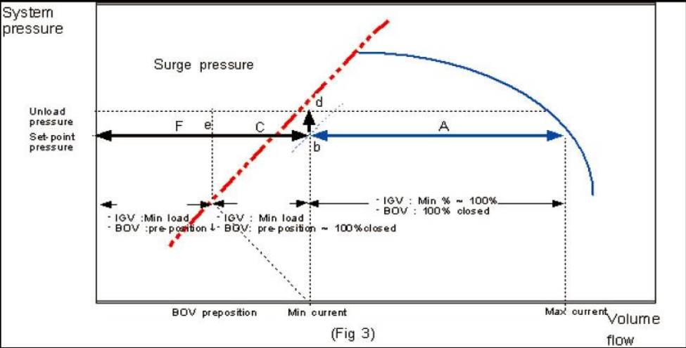
Breaking Down the Compressor Map: Key Features Explained
Let’s dissect a typical centrifugal compressor curve element by element.
1. The Axes: Flow vs. Head
X-Axis (Inlet Flow): This is the actual volumetric flow at suction conditions. It’s critical to note that this is inlet flow, not standard flow. As suction pressure or temperature changes, the actual cubic feet per minute entering the machine changes too.
Y-Axis (Head or Pressure Ratio): Polytropic head is the most common unit because it is independent of the gas’s molecular weight. A given compressor generates a specific amount of head per stage, and the resulting discharge pressure depends on the gas composition.
2. The Speed Lines
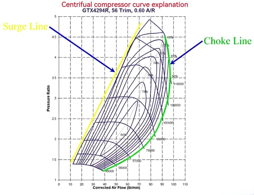
The most prominent feature of the map is the series of curves running from left to right. Each line represents operation at a constant rotational speed (e.g., 100% speed, 90% speed, 80% speed).
Notice the shape: as flow decreases, head increases, but only to a point. This characteristic “droop” toward lower flows is the most critical behavior to understand. At a fixed speed, the compressor inherently produces a defined head for a given flow, and you cannot operate arbitrarily off this line without changing speed or using external control methods.
3. The Surge Line (Left Boundary)
Running along the left edge of the map is the surge line. This is a hard boundary — the compressor must never operate to the left of it.
What is surge? At very low flow rates, the flow becomes unstable. The impeller can no longer sustain the discharge pressure, and gas momentarily reverses direction through the compressor. This flow reversal collapses the pressure, the flow resumes, and the cycle repeats violently — often several times per second. Surge sounds like heavy banging and can destroy bearings, seals, and impellers within minutes.
Practical takeaway: The surge line is your “do not cross” boundary. Anti-surge control systems continuously monitor operating point proximity to this line and automatically open a recycle valve to maintain minimum safe flow.
4. The Choke or Stonewall Line (Right Boundary)
The right-hand boundary is the choke or stonewall region. At very high flow rates, the gas velocity through the machine reaches sonic velocity (Mach 1) at some point — typically in the impeller eye or diffuser throat.
What happens at choke? Once sonic velocity is reached, the mass flow cannot increase any further, regardless of downstream demand. The compressor is “stonewalled.” Operating deep in choke is inefficient and can cause high vibrations, but unlike surge, it is generally not destructive in the short term.
5. Efficiency Islands
Superimposed on the speed lines are closed-loop contours called efficiency islands. These look like a topographic map and show the polytropic efficiency at every operating point.
The center of the innermost island represents the Best Efficiency Point (BEP) — where the compressor operates at its highest efficiency. Operating far from BEP, even if safe from surge and choke, means higher energy consumption and operating cost. The goal in process design is to match the normal operating point as close to BEP as possible.
How to Use the Curve: A Practical Example
Imagine your process requires a discharge pressure of 50 bar with a given suction condition. You look at the map and find that at 100% speed, this corresponds to a flow point that sits right on the surge control line.
What are your options? The curve tells you:
Recycle: You must recycle (spill back) some discharge gas to the suction, effectively increasing the apparent flow through the machine to move the operating point safely to the right.
Speed Adjustment: If you have a variable-speed drive, you can reduce the speed. At 90% speed, the same head requirement now sits at a higher, safer flow position on its respective curve.
Process Change: If neither is viable, the process design must change — the compressor is simply too large for the required flow at this head.
Factors That Shift the Curve
The performance curve is not fixed forever. Several real-world factors can shift the map:
| Factor | Effect on Curve |
|---|---|
| Suction Pressure Change | Mass flow changes proportionally; the operating point shifts on the map |
| Gas Composition (Molecular Weight) | Pressure ratio changes for the same head; discharge pressure rises or falls |
| Suction Temperature | Higher temperature reduces mass flow density; can push the point toward surge |
| Impeller Fouling | Reduces efficiency and head; the entire speed line sags downward over time |
Key Terms at a Glance
| Term | Definition |
|---|---|
| Surge Line | Minimum stable flow limit; operation left of this line is destructive |
| Choke / Stonewall | Maximum flow limit where sonic velocity restricts throughput |
| Speed Lines | Constant RPM curves showing head vs. flow characteristics |
| Efficiency Islands | Contours of constant polytropic efficiency on the map |
| BEP (Best Efficiency Point) | The operating point with the highest efficiency |
| Operating Envelope | The safe area between surge, choke, maximum speed, and minimum speed |
About Centrifugal Compressor Curve Explanation Conclusion
A thorough centrifugal compressor curve explanation reveals the map as far more than a graph — it is the machine’s DNA. The speed lines tell you the inherent capability, the surge line warns you of imminent danger, and the efficiency islands guide you to cost-effective operation. Understanding these elements transforms you from a passive operator into someone who can predict and optimize compressor behavior.
Master the curve, and you master the machine.
Have a specific operating condition you’re analyzing? Share your process data, and our engineering team can help you interpret where you’re running on the map and how to optimize it.
Read more:
Pingback: Centrifugal Compressor Surge: Causes, Fixes, and How to Prevent It - Turbo Compre‘’锡透动力‘’无锡艾尔泰科压缩机
有任何关于离心式压缩机的相关问题,可以联系我们。